Katherine Bradford - Mother Paintings
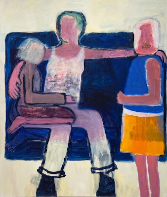
Katherine Bradford's Mother Paintings are mildly clunky abstractions filled with domestic symbolism. Motifs and techniques from past bodies of work reappear here, with more or less success. The large canvases are filled with imposing blocks of color, awkwardly positioned, somewhat cartoon-like figures, and thin washes of acrylic paint. But her repetitive and limited approach unifies the work. The color fields are consistently flat, the figures are invariably outlined, and patches of thinned out acrylic are invariably if haphazardly, placed on top. Bradford makes it clear we are to take the figures lightly; there is humor in the awkwardness of the occasional big foot, or short arm, or block-like head. The figures, some of which are larger than life, are placed close to the edges of the canvas, as if they can barely fit into the picture plane, causing nice compositional tension. By contrast, in her earlier Pool Paintings, a great deal of compositional energy was expended on constructing a deep and vast space in which the unimposing figures are mere blobs of a single color. In this recent series, the figures are the center of attention and the space around them serves simply to contain and balance. The arms and hands of the figures all express one thing - comfort. And this brings us to a clear theme of the show, for this, comfort, is one of the central tasks of motherhood. The sense of warmth and domestic coziness in these paintings, especially in the gestures of the figures, surely also speaks to what we all can use as we make our way through this long pandemic. The scale of the mother figure in paintings such as Motherhood, Mother's Lap, and Guest for Dinner speak to the role of the mother from a child’s point of view. The mother's arms stretch unusually far to console her child in Motherhood, the mother's lap is unusually big in Mother's Lap, and so able to accommodate all of her several children comfortably; in all of these paintings, the mother's presence takes over the room.
The
bright reds, oranges, and pinks accentuate the light-hearted nature of the
paintings; the frequent pale yellow adds a subtle glow. The dark outlines of
the figures accentuate the figures’ clunkiness, but in doing so, express the
artist's confidence in her constructions. Each painting has some odd element or
other that the viewer can't help but notice and attend to: a glowing pair of
white undies, lumpy yellow circles for boobs, a funky pair of tights, a
scribbled barely human face, a clownishly long bowling shoe. As much as these
paintings reference classic color field abstraction, these odd elements also
pull them towards a world of eccentric personality and striking atmosphere.
It's as if Bradford is constructing the world as it might be when seen through
the eyes of a child. The color blocks stand for auras or feelings, the odd
symbols and fuzzed-out areas stand for things not completely understood. The
grandeur of the mother figure dominates the child's vision, underscoring the
role of the mother as the most important thing in the child's mind. A mix of
satisfying and sometimes frustrating elements, it is a consistently engaging
show.

Comments
Post a Comment